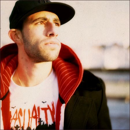
JON CONTINO HAS NO HESITATION when naming his biggest influence: It’s The City. New York City, a comforting presence, a constant source of inspiration.
“My whole life I’ve been surrounded by incredible design, architecture, fashion, and, most importantly, graffiti,” Contino says. “I don’t know how I’d ever be where I am today without it.
“My environment definitely had a massive part in shaping me as an artist and I really can trace it back all the way to my very early childhood. I would have very little style if it wasn’t for New York and all the incredible people that live and work here.”
Two years ago, Contino left a full-time job to start his own design studio, Onetwentysix, based in New York. His clients include ESPN, The Brooklyn Circus, Russell Simmons, and Marc Ecko.
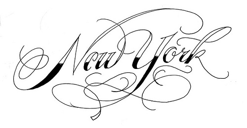
Do you remember when you first became obsessed with letters?
I remember I was always obsessed with letters, but didn’t realize it was an obsession until a few years ago. I dug up a few sketchbooks and drawing pads from my kindergarten days and found pages and pages of “my own alphabet” type things and Major League sport team typesets scribbled everywhere. That’s when it hit me that I had an obsession on my hands.
What clicked a few years ago? What was the catalyst that led you down this lettering path?
I had been freelancing as a graphic designer for a while and in 2005, I finally got sick of working by myself and got a full-time job at a firm that did a lot of “cool” projects. The work wasn’t really that cool, but the people working there were actually creative and not corporate, which was completely mind-blowing to me. One guy who worked there was an ex-graffiti artist named Mike Bisesti and he would always bring up the topic of lettering and font design.
I’m a huge Herb Lubalin fan … I think above anyone, he deserves the most credit in inspiring my love for letters
For some reason I never really thought too much to actually bring it up in conversation. I didn’t think many people around me would care very much about what I had to say when it came to drawing letters. Once he opened up the flood gates, we would sit down and do a lot of hand-drawn typography for clients and it really just started to blossom from there. Since then, it’s been my main focus in all my artwork and I don’t think I’ll ever look back from here.
Has Mike seen your progression, and do you guys still talk about lettering?
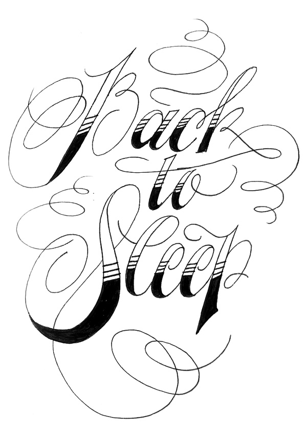
Yeah, we actually get together every now and then to draw random lettering projects. The last one we worked on together was for a tattoo I planned on getting. I knew it had to be strictly lettering, but there was no way I could possibly draw something like that for myself. Mike helped me out with different variations and styles for it and helped me decide which direction was best. I think Mike has slowed down a bit in his drawing, but I think we both pushed each other’s styles a lot as we started to work together more and more. We learn a lot from each other.
I saw that tattoo, that turned out nicely.
Thanks man. The final lettering design was actually done by Brian Paul at Lark Tattoo. He does fantastic lettering as well and I decided after hours and days and weeks of sketching that I could never have my own work on my skin. Brian really took it to the next level and made it fit perfectly on my arm.
Besides Mike, who were your other influences?
I’m a huge Herb Lubalin fan. His career as a designer really helped me focus on being a great typographer. I think above anyone, he deserves the most credit in inspiring my love for letters. No one else has ever had that kind of impact on me in terms of my art. Actually, Ralph Steadman’s overall style has played a big part in the organic nature of my work as well. Lubalin and Steadman are the greatest.
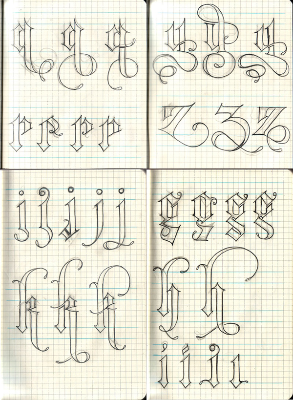
You have a lot of love for Blackletter. How did you end up working so much in that style?
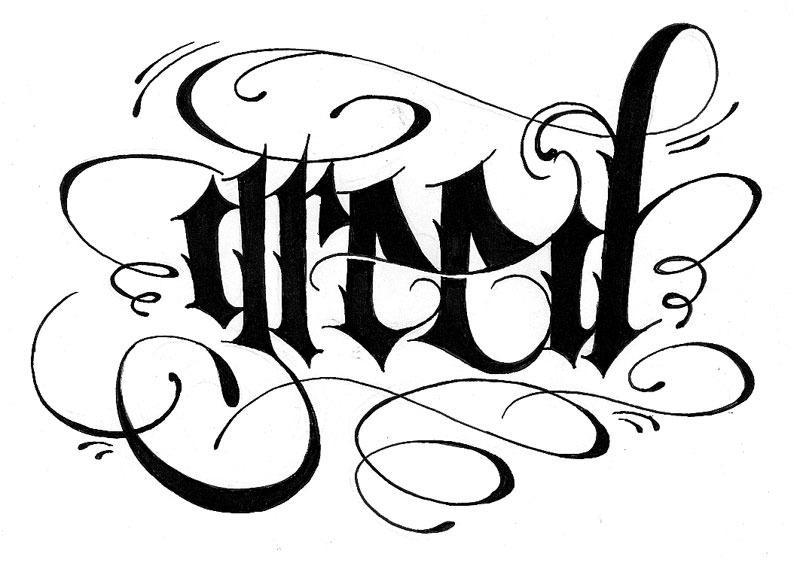
That’s a really good question. I go through serious phases in my lettering styles and that blackletter phase lasted the longest I think. My love for metal band logos probably made that one sink into my subconscious. I don’t really know how the hell else that could’ve gotten in there to be honest. I missed the boat on being a designer for the German government in the early 1900s.
You have some great Blackletter sketches. Any chance you might turn some of those into a font?
Thanks a lot! A font has actually been in the works in conjunction with my pal Ale Paul of Sudtipos for over a year, but unfortunately my day-job has put that in the backseat. Maybe one day!
Nice, looking forward to it. Can you explain more about your process and the tools you use to do your lettering?
Absolutely … My number one weapons of choice are a Staedtler HB pencil 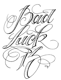 and a sheet of white printer paper. I kind of found out by trial and error that my best work comes on the cheapest white paper. Usuaully I will sketch out a baseline first or a shape that I want my letters to fall into, then I will draw a light skeleton of each form with a decent amount of space so I can give each letter a bit of depth. After that, I lightly draw in the first rough draft with a very soft mechanical pencil and then trace over it again with my HB a littler darker. Once I have that done, I’ll clean it up a bit with a Mars eraser pen and then trace over it again once more time with my HB. If the design doesn’t call for pencil strokes and something a littler cleaner, I’ll use a Micron, at the appropriate size, to trace over the design completely. After I’m pleased with the inking, I use a big fat kneaded to completely clear away all the pencil marks until only the ink is left. Then it’s just a matter of scanning or tracing in Illustrator. I usually do most of my coloring and shading on the computer strictly because it’s a huge time-saver.
The Brooklyn Circus seems like a fun client. What kind of reaction have you gotten from the work you’ve done for them?
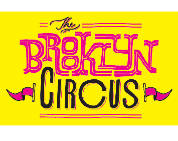
Oh man, The Brooklyn Circus has been an amazing client. They’ve really helped me raise the bar in terms of my lettering style as a form of illustration. The head honcho over there is a guy by the name of Ouigi Theodore, and he really knows how to push the boundaries of my work until something great comes out.  The guy’s got this extraordinary vision and once he locks in, he translates it perfectly to me. It’s really great because we’ve been working together for a couple years now and the creative process has really started to flow over the past year or so, especially since he’s seen how far a good lettering design can go. Once I draw up a sketch, the two of us discuss what works and what doesn’t and then it’s either good to move to the next phase or dropped into the vault for another day…or the garbage. The reaction on both our ends has only been getting greater and greater as our relationship grows. It’s really an amazing process that I never really thought I’d get out of a client.
Lastly, what are five things that people don’t know about you?
Oh man, that’s a great question and very unexpected. I’m a pretty open guy so I feel like naming five things would be kind of tough, but I’d probably say my love of sports is the number one thing most people in the field don’t know about me. I’m a huge jock at heart and wish I could be playing shortstop for the Yankees instead of Jeter. I also have an insane amount of allergies and stomach problems that keep me from eating pretty much anything. My diet consists solely of water and turkey sandwiches. I grew up in the New York Hardcore scene playing drums in a lot of bands, I didn’t have a growth spurt until I was 17, and I kind of love the movie Miss Congeniality.
LINKS
Onetwentysix
Onetwentysix blog
Jon’s Flickr
SEE ALSO
Lark Tattoo
The Brooklyn Circus
Alejandro Paul
Herb Lubalin
Ralph Steadman
Luc Devroye’s Blackletter Page


{ 4 trackbacks }
{ 6 comments… read them below or add one }
smashing 09.26.08 at 6:37 pm
A great up and comer featured recently at Smashing Magazine.
Chocoserif 09.30.08 at 4:05 pm
Hi, excelent interview, i got a blog about type in spanish and i was wondering if i can translate them.
Ouigi 12.25.08 at 9:08 am
Jon Contino is a young Paul Rand, Milton Glaser and Wally Olins tied into one. Patient, skilled and has a genuine love for type. There, we said it!
deepal 03.16.10 at 2:44 am
gr8 wepsite
asalia najera 04.30.10 at 2:41 pm
ur draws r wondeful there kool
destiny rose 08.30.10 at 4:45 pm
hey you should mail me on myaspace the alphabet of that sleep lettering please
and mucho gacias homes