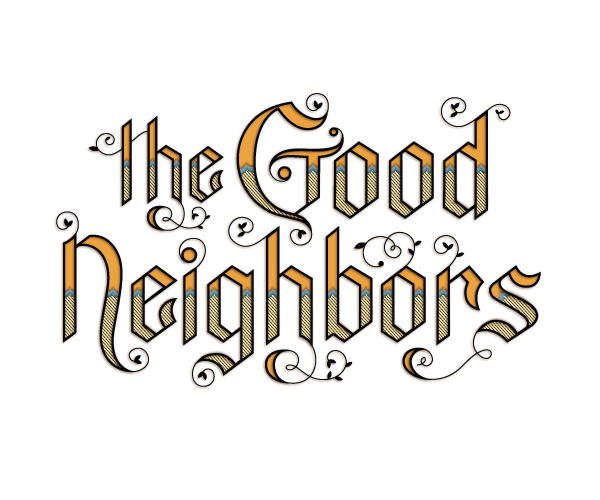
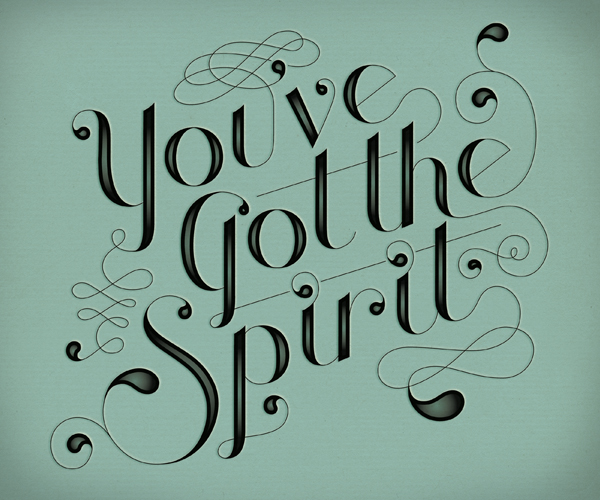
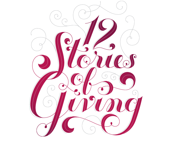
“The work you do while you procrastinate is probably the work you should be doing for the rest of your life.†— Jessica Hische

RIGHT NOW, FOR JESSICA Hische, that work—the work she should be doing for the rest of her life—is making letters.
Right now, she sits at a computer in her Brooklyn apartment, hanging out with her two cats as she chats on the internet.
The cats try their best to stop her from working—blocking access to her mouse, and laying down on her keyboard. But Olive (fat and loud) and Billy (a space cadet who sings in the shower) are prone to constant naps and have not been very successful stopping her.
Indeed, in 2009, Jessica Hische was unstoppable.
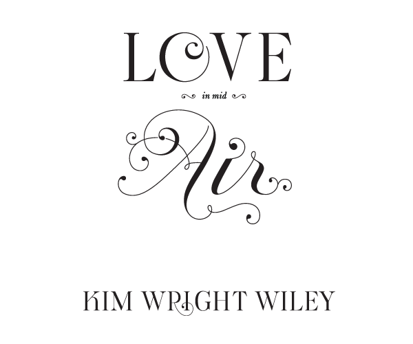
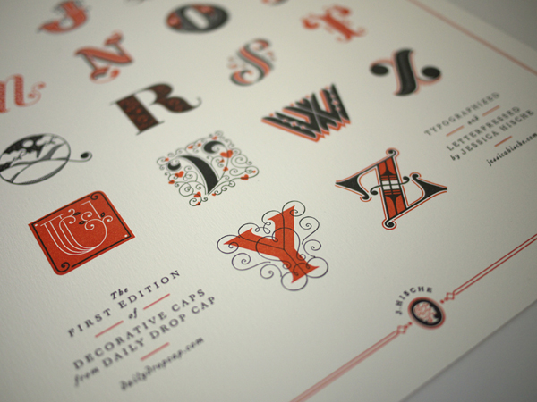
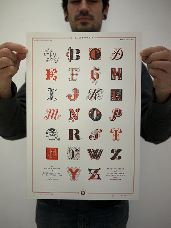
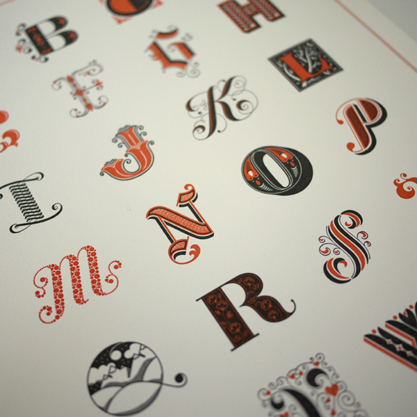
She began 2009 as a senior designer at Louise Fili’s acclaimed design studio and went full-time freelance in September; she completed illustrations for a variety of top publications; did tons of amazing lettering, including the new Louise Fili identity; released her first font, Buttermilk, a big success; began selling letterpressed posters; and started a site, Daily Drop Cap, which now gets 2,000 visitors a day.

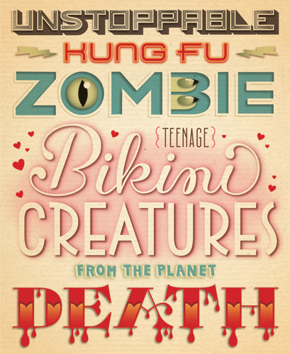
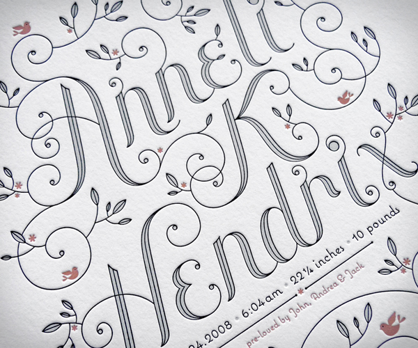
All this a little more than three years after graduating from Philadelphia’s Tyler School of Art.
“Jessica has a can-do approach to absolutely everything,” Fili says. “For her, nothing is insurmountable.”
In 2006, Hische was living and working in Philadelphia, teaching some classes, and establishing freelance contacts. She made a promo to send out for the holidays—the Twelve Days of Christmas, each day illustrated on its own postcard. She sent the promo to 250 magazine and agency ADs, and also to “a few people I thought were awesome,” she says, “including Louise Fili, Christoph Niemann and a couple others.”
Fili was the only one who responded. She asked Hische to come to New York ASAP.
“I had no idea it was for a job interview,” says Hische, who turns 26 in April. “I thought she just wanted to see what the youth of today were doing or something. At the end of the day, she offered me a job and I had to drop everything and move to New York in two weeks.”
Early on at Fili’s studio, Hische showed great potential and proved herself with every new piece. She moved quickly from junior designer to a senior design position, and worked well with Fili, who became her mentor.
“Louise is a true art director,” Hische says. “Her employees (usually just two, a senior designer and a junior designer) are her hands and she is the brain so anything that comes out of the office is fabricated by one of her designers and conceptually developed by Louise.”
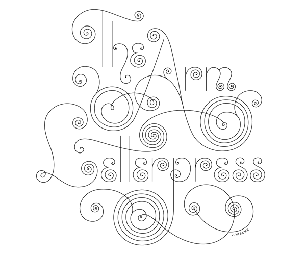
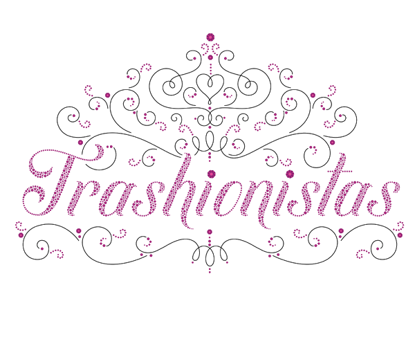
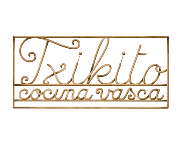
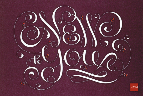
Hische crafted logos and designed books, and put in countless hours behind the computer, tweaking beziers, making bowls and tails curve just right. Fili has a large collection of type specimens, and Hische often spent an entire day working with letters—inspired by the fanciful specimens from past eras.
“Anyone can be a good letterer,” she says. “I was able to become so good at lettering because I drew it literally all day, every day, for three years. I would go to work for Louise and draw type all day, then I would go home and work on freelance work or personal projects until 1 or 2 a.m.”
That breakneck schedule was the main reason she wanted to go 100 percent freelance. But leaving Fili’s studio was difficult.

“She has been the biggest influence on my career and work and I still talk to her often,” Hische says. “When I was working for her I was always really impressed with ways she ran the business or how she treated people and clients…she would always be doing nice things for us (her employees) like bringing in pastries for ‘inspiration’ (when I was working on a book about patisseries) and celebrating our birthdays, cooking us lunch on occasion, etc. I hope that when I am a boss, I can be so down-to-earth and thoughtful to my employees.”
Before going freelance, Hische had planned ahead, figured out a budget, and got encouragement from her rep, Frank Sturges, and a blessing from Fili. She went full-time freelance last September, and so far, so good. Hische just hired an intern to help her handle her increasing volume of orders from her online shop.
Congratulations to Jessica Hische, our 2009 Person of the Year!

Do you think an ability to make letterforms is a necessary skill for designer today?
I think its a misconception by people that do custom lettering that it is a skill designers should want or need to learn. I know plenty of designers that are great with type, but terrible at drawing letterforms and don’t really have a desire to learn. This is why fonts exist, for designers who are great with type and can pick appropriate type for projects…I’m a real believer in hiring specialists for what they do best. I wouldn’t expect someone to come to me to design a corporate website, it’s not what I specialize in. I think if you understand what you are best at, and know to hire out when you need to, that is design at its best.”
Clients who come to you know they’ll be getting letterforms built from scratch, typically. What is it that attracts you to doing Custom Letters?
Having complete control with how everything looks and feels. There is a humanity that comes across in lettering that you don’t always get with fonts. You can see the personality in the slight imperfections. It’s the same way that if you take type and print it out and scan it back in. There is a warmth that you get that isn’t there without going through the replication process. Most of the type that I draw, I draw because there isn’t a font that is close enough to what I want. Sometimes I do use fonts in conjunction with lettering if the font is right.
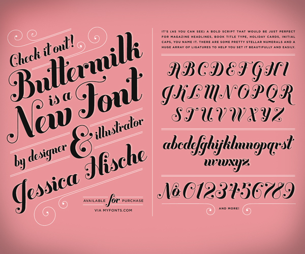
You released your first font, Buttermilk, last year. What was the process like of getting Buttermilk fontified and ready for release?
I had started out as just drawing the alphabet in Illustrator because I had a few characters drawn already. I originally drew the type as a part of a logo presentation that was rejected. I really just made it into a font because I was excited to learn about FontLab. I drew everything in illustrator and then copied the characters into FontLab (I know you type designers are cringing right now). It took me about two months, on and off, to finish kerning it and whatnot, and when it was done, I contacted both Veer and MyFonts about selling it through their sites. MyFonts responded, and I started selling it a month or so later.
Are you considering releasing more fonts?
Hopefully! Type design is a very involved and tedious process. You forget about all of the accent characters, punctuation, etc. that are essential to a well-made font. I still feel like a novice in FontLab…so, yes, I definitely plan to do more fonts in the future, it’s just been hard to find the time to focus on type design with my freelance work.
You’re a perfectionist with your letters and your illustrations. When did you realize this?
One of the main reasons I started doing lettering is because I felt that fonts weren’t quite right with design projects I was working on in school. I knew that it wouldn’t feel perfect unless the lettering and the image and the design all matched perfectly. From the beginning I worked toward making things as good as I could and as my skills developed, I could make them better and better. Everything you put into the world is representative of you, and I would never want someone to see that one piece that I slacked on and think that it was the best I could do.
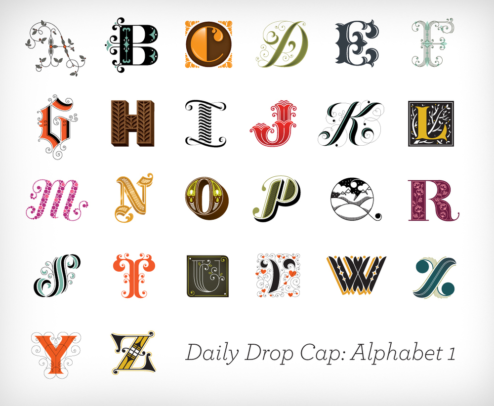
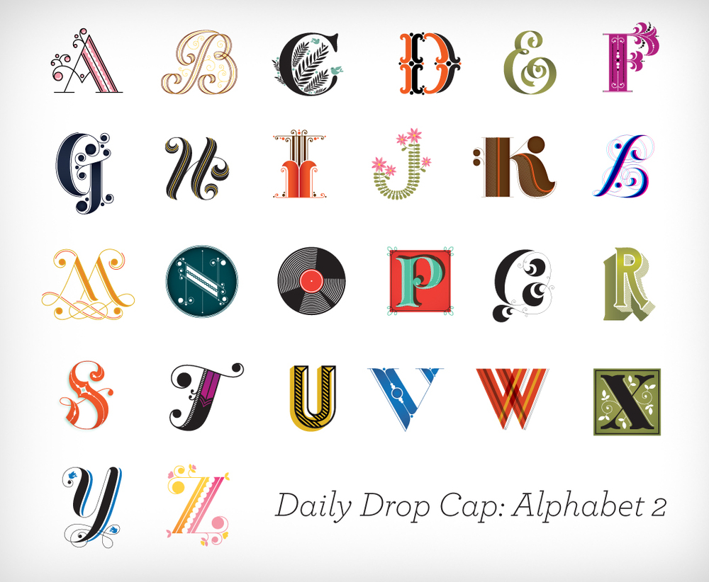
What was your inspiration for Daily Drop Cap and what kind of response have you gotten?
I really wanted to challenge myself to do something every day or every week after I left my day job. When I was working a day job, and doing freelance, I just didn’t have any time for personal projects so I wanted to take advantage of my new freedom. I originally wanted to do an alphabet per week but realized this was a bit ambitious after the freelance started to clog up my calendar, so I settled on a letter per day. The response has been amazing. I get so many Google alerts of people blogging about it or implementing it into their site. In the first month, the site had 90,000 visitors and it’s been holding steady at 60,000 per month since (which doesn’t count RSS feed subscribers).
Considering you were a student not too long ago, was it weird to start getting so many e-mails from students?
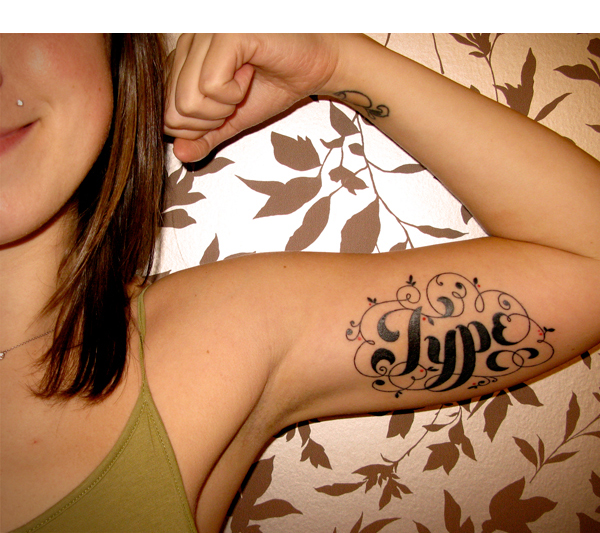
It was, though I think the main reason I get so many of those e-mails is because I’m so young. Students want to know how they too can fast-track their career and the most popular questions I’m asked are “What did you do to start getting so much work?” “How did you start working for such great companies?” “What can I do to start doing work like you?” etc. It’s hard to answer these questions because really what worked for me isn’t going to work for everyone. I got my rep when I was just out of college, mostly because I knew a few people already represented by him. I had the amazing opportunity of working at a job where I got to do really creative work all the time, and develop a skill (lettering) that not everyone does, and that had just come into major popularity in the last few years. I moved to New York and fell into a group of friends that were really motivating. What I do is kind of specific, illustration and lettering with a graphic design background, and I don’t really know what to tell young designers that aren’t interested in illustration how to promote themselves and get work. The three disciplines are all very different and for me they all came together in a great way.
Can you recall a time when you first really noticed letters?
I think the first time I really noticed letterforms was when I was learning cursive writing in elementary school. I loved the banners with perfectly drawn letters above the chalkboard. In fourth grade, and beyond, I did a lot of doodling with letterforms…Of course I was also the go-to person to draw people’s names on their notebooks in graffiti-esque writing.

What other lettering artists inspire you?
Letterers: Marian Bantjes + any letterer who does things by hand (I’m a computery type nerd so handskills impress me to no end), pretty much everyone in the LetterCult LetterMakers list 
Type Designers: H&FJ, Alejandro Paul, Mark Simonson.
What’s next for you?
I’d like to expand the Daily Drop Cap project into products, so I think that’s what’s next on the horizon. I also started a bit of a sub-company called Unofficial Business Co. through which I’ll be releasing notepads of the Day-Ruining Invoice I created a little bit ago [ed: now available]. Other than that, more book covers, lettering, advertising work, letterpress, etc.
What do you like most about letterpress?
There are a few reasons why I love letterpress. Of course, because it looks great, but mostly because it’s a way for me to feel like I’m making actual artwork and not just something that exists on the computer and is gone in a week. The reason why I got into print design is because I love being able to feel and touch what I make. With most of the work that I do, I never get to see the printed final. The piece only exists for me on my computer. Letterpress is definitely the most tactile of the print mediums and being able to feel the curves of the letterforms I make with my fingertips is really satisfying.
And finally, what are five things people don’t know about you?
These are a bit tough to come up with because I think I’m a completely compulsive internet over-sharer and am definitely an open book to anyone I meet. Here are five things I think most people don’t know about me:
1. My favorite movie of all time is The Secret of NIMH. I used to watch it every time I got sick as a kid and I still do that as an adult.
2. I met my boyfriend on match.com.
3. I can’t handle the teacups ride at amusement parks, but I’ll ride any rollercoaster.
4. I know all of the words to several Tupac songs (left over from the “Zima and Jolly Rancher” years of my early teenagehood).
5. I own so many clothes (because I’ve been basically the same size since age 15) that I only have to do laundry once a month or sometimes not for two months.
UNTIL WE GET OUR COMMENTS WORKING PROPERLY…
give Jessica a shout-out or feedback on Twitter: www.twitter.com/jessicahische
LINKS
SEE ALSO
MORE
