
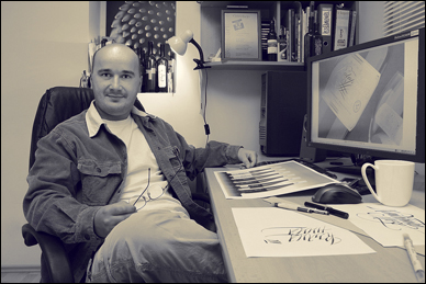
EVERY SO OFTEN, THE mail carrier arrives with another bottle of wine, another gift from a client for a job well done.
Jordan Jelev opens the box, unwraps the wine, and studies the label.
The wine label is his canvas, a place where he transforms his design and lettering into hand-crafted works of art.
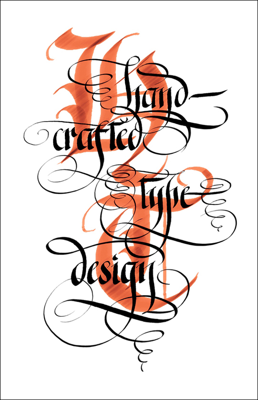
Jelev, a designer from Bulgaria, has earned a reputation for his excellent wine labels—his nickname is The Labelmaker—but his work goes beyond labels. Lately, he has been experimenting with different approaches, different tools, and different styles. Making letters has become his work, his play, his obsession, his passion.
The free bottles of wine aren’t bad, either.
“Yes, I am a dedicated wine drinker, though I consider myself a total amateur in this field,” Jelev says in an email, adding his usual  at the end.

The fact that Jordan Jelev is making letters at all is something of an upset.
He graduated with an Economics degree and was preparing for a career as an accountant or bookkeeper. He probably wouldn’t have discovered lettering had his father and wife not given him a set of automatic pens and some pen nibs as a surprise gift.
“I do not know how it happened—seriously. It just happened,” Jelev says. “I think I will have to kill myself if I had to work according to my education…a bookkeeper, for example. Funny—could not stand it.”
We communicated via e-mail over the past few months for this Q & A.

How would you describe your fascination with letterform?
For me, letters are maybe one of the most interesting things and phenomenons in the world. I mean it because I see it everyday in my work and in my life. It’s a real miracle to express yourself with writing…to make a long, long swash when you are happy and a short, sharp stroke if you are
angry. Calligraphy gives you a true chance to be what you want to be, to be yourself, to free your emotions, and your senses. And if it is really good, people can read it.

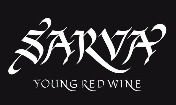

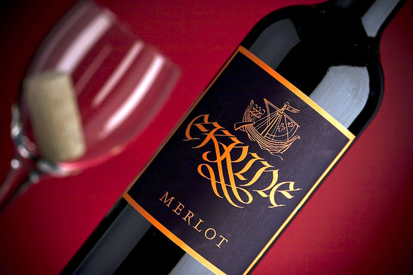
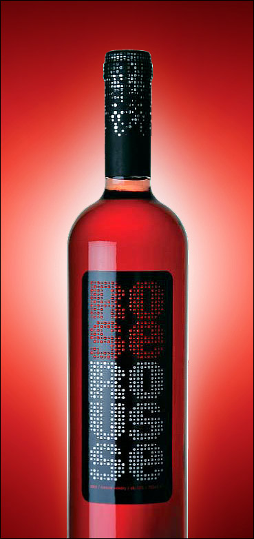
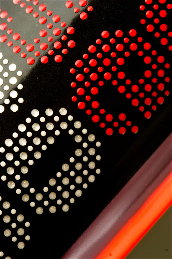
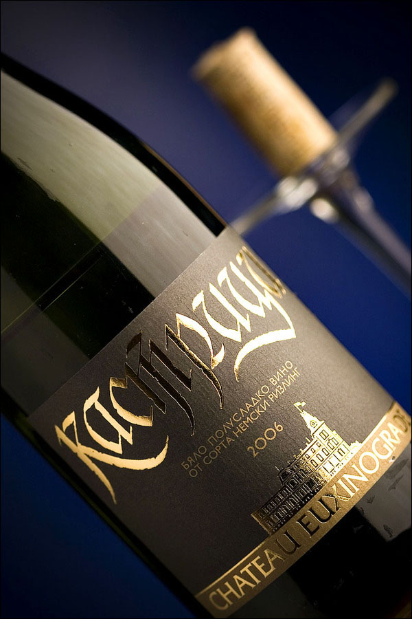
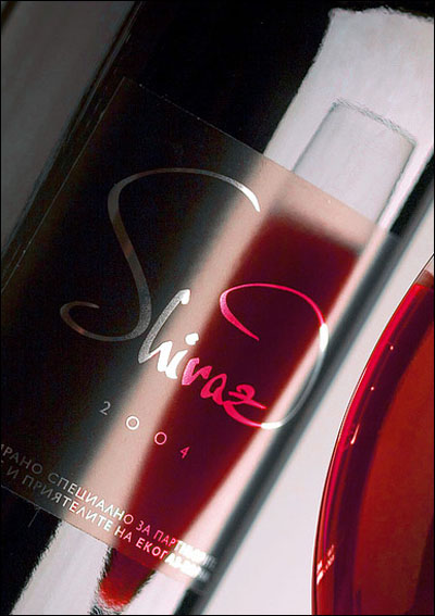
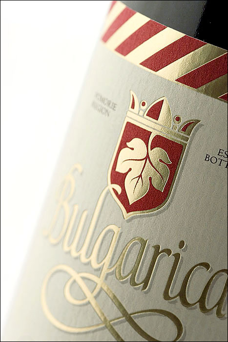
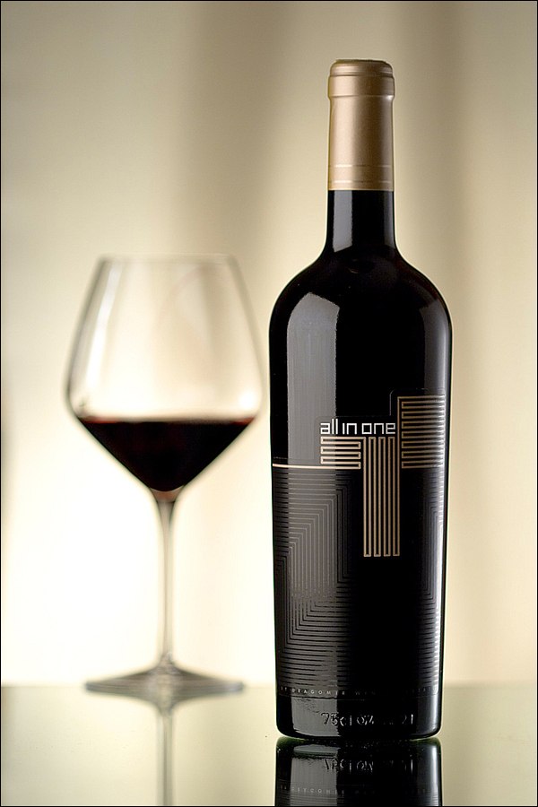
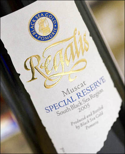
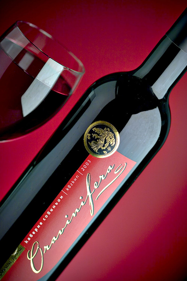
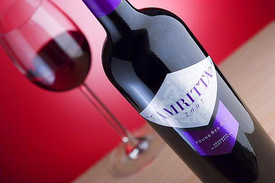
You’ve received a lot of attention for your work on wine bottles. How’d you get involved and what do you like about that medium?
It all began some 13 years ago. I started working for www.factor-r.net and the studio already had some wine clients I started with. Then, I made my own style of how to make labels and packages and the
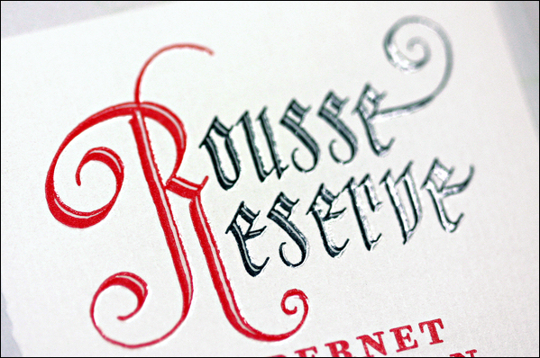
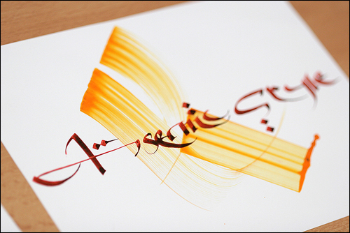
number of clients grew bigger and bigger. Of course, there is no need to say that a large part of my wine labels is based on calligraphy, or sometimes my whole label is totally hand-crafted.
The calligraphy itself makes my labels more distinguished, more recognizable. It is really hard to find one that uses custom lettering in the 21st Century—instead of a large amount of digital fonts. Anyway, I am addicted to calligraphy. It gives life, color and emotion to my work. It all looks different, and here, in my country, almost everyone knows it is done by me.
How did you make the switch from Economics to design and lettering?
Well this happens here really often—you can see a doctor driving a cab, or an engineer selling tomatoes.
My case is not exactly like those I mention above…Here is the situation: After finishing my service at the Navy in March of 1996, I had three things of importance:
1. I got my discipline in the Army.
2. I wanted to get a good education.
3. I already had the experience of graphic design and pre-press while doing everything around the Navy newspaper Morski Dnevnik
So having 1,2,3 on my mind, I decided that an Economics degree will be good for me in the future, and on the other hand, I was totally convinced I would have to both study and work.
I started working at Zograph Studio from 1996 to 1998—there I had my experience with pre-press, graphic design, typography, some different machines like several imagesetters, etc. And while being a student in Economics, I began to realize I had some extra powers as a graphic designer and even pre-presser. In fact, the truth is that I am popular as a graphic designer, but I have remarkable experience in the pre-press field and in offset- and flexo-printing that I keep a secret, though some of my colleagues know it.
Your secret is out.
Yes. They use me as an adviser on some difficult projects. So I saw that my skills are in graphic design and I started developing them. Now, I do not even know where my diploma is. I think it is somewhere in a drawer at my office, but I do not think I would try to find it.
Was your family disappointed you didn’t stick with Economics?
Nobody was disappointed, because it was quite obvious I had a lot to show in the field of design and less as an accountant. So nobody got disappointed and nobody ever thought to give me directions in my life—I have made a choice and I followed it on my own.
So as a designer, you are self-taught?
Yes, completely self-taught.
What is Bulgaria like for design?
That is a long conversation. We should make a separate one for this question exclusively. I wish there was a better design climate here and because of some regional exceptions here, I do believe the situation will change in the near future.
Where did you look for design inspiration?
Well, I started to look at what others do. In 2000, there was almost nothing to inspire me, except my friend Dimitar Traychev. In fact he is an inspiration for a whole generation in Bulgaria, I think…but that’s a long story too. He is a very interesting person!
You are also following in the footsteps of Luca Pacioli, right?
Luca Pacioli was the father of double-entry accounting, but in fact, he was an artist. He even designed his own typeface. So I am not an exception—seems there is some strange liaison between
Economics, calligraphy and design.
You’re learning more new techniques and styles and pushing yourself in different mediums. Why is that important to you?
I think I would never stop learning more and more. For me, that is the only way to find myself, my mood, my emotions—it is something like fitness, but not for your muscles, but for your soul.
I’ve always had some crazy ideas, some of them already seen, but I think I have far more to learn from now on.
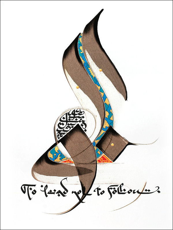
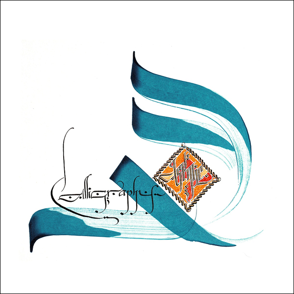
Your work has been evolving, from Blackletter to Islamic calligraphy. Can you explain the connection?
Yes, I mix them…there is a close relationship between those two writing styles. I think the origins of Blackletter are in the Islamic culture. I do believe this is true. I am a Blackletter addict. This inspires me really a lot—every letter is a unique logo. I can write Blackletter every day. This love of mine led me to follow Islamic calligraphy, Persian especially…and I found for myself the relationships between gothics, Islamic writing, and those artistic strokes we can find in graffiti…it is all same thing, same culture,
same vision, spread over several centuries of history.
Who are some of the calligraphers who have inspired you?
There are two great guys that give me a lot of inspiration every time I look at their works—Hassan Massoudy and Julien Breton. I love their work and I am learning from them—it’s like trying to play
something from Mozart, Beethoven, etc., but in calligraphy. I am trying to get to their level and style and from this state, to generate my own calligraphy.
You’ve been experimenting a lot with rice paper. What attracted you to
this texture, and how has that been working out?
Well here, the most interesting things are:
1. The ink stays really wet on the paper, and makes small ink spots on it, which basically forms the texture inside the letters.
2. You can use a backlight to make your calligraphy glow, which I found is really interesting and really simple to do. Just put a lamp behind it and everything changes.
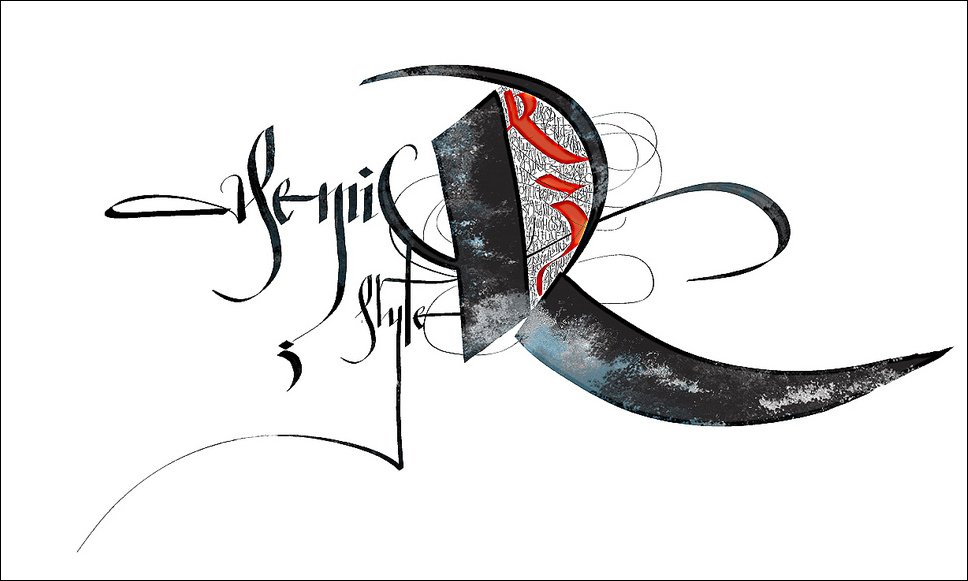
Can you explain Asemic calligraphy for those who might not know what that is?
Asemic calligraphy is a group in Flickr I came upon a few months ago and I loved this name.
Asemic stands for means nothing—strokes, letters, swashes, moods, gestures—it is just calligraphy that means nothing and could mean anything.
What different tools and ink that you use for your different types of calligraphy?
I do not use so many tools as it possibly looks. I use a thick paper nib, or a wood nib for the wide strokes. I often use bayonette nibs, copperplate nibs, oblique pen holder….what else, automatic pens,
coit pens…and a pilot parallel pen thanks to my friend Maxim Ivanov. And I sometimes use some strange tools like pipette, chopsticks, and many others. I have recently started working with acrylic ink for airbrush of Pebeo—Julien Breton advised me so. But I mostly use Windsor and Newtone inks
and Talens Ecoline.
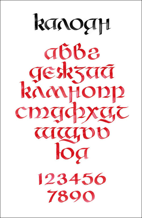
Recently, you collaborated on a typeface with FontFabric.
Yes. It is a strange Blackletter type called Grant. But this is only the beginning. We want to start two more projects—the Kaloyan Typeset and another Blackletter type that is still unnamed.
You got a Wacom tablet in late 2008. What can you tell us about the
results digitally vs. the results with ink on paper?
I think both cannot be compared. They both do calligraphy, but the result, the feeling, the style—everything is totally different. In digital, you have software, wires, some strange tools, plastic
surface, digital simulation pressure levels etc…and a digital print finally.
What are some of your goals for the near future?
Well, there many goals, in fact a lifetime would not be enough for me to make everything, so I stay with only 3-4 of them.
1. Maybe I will concentrate some efforts in type design.
2. Maybe I will try to approach some wineries in USA and Australia.
3. Maybe I will continue mixing my style in calligraphy between digital and traditional.
4. And of course I will look after my kids (two daughters) and wife.
What are 5 things people don’t know about you?
1. I read a Latin dictionary in my bathroom.
2. I read a wine encyclopedia in my second-floor bathroom.
3. I am afraid of heights.
4. I love to use my 4-stroke engine Honda lawnmower.
5. I hate to walk barefoot.
LINKS
SEE ALSO
Asemic calligraphy group on Flickr
MORE


{ 4 trackbacks }
{ 10 comments… read them below or add one }
Viktor Kalvachev 08.10.09 at 11:15 pm
I am absolutely fascinated by Jelev’s talent! You can’t learn this stuff, you are either born with it, or you are not. Thank God he didn’t become an accountant Incredible, incredible work, Dancho!
Miguel Angel 08.11.09 at 9:30 am
He is one of the best! I love all his work. It would be such a waste of his talent should he have stayed behind a desk crunching numbers. The world needs to experience his creativity.
ufuk 08.12.09 at 1:51 am
as a calligrapher i can honestly say that he is magnificent.. his works are unique.. and he is beyond a designer…
Ayuli Spiegel 08.12.09 at 3:56 am
Very nice, good work.
Ayuli Spiegel 08.12.09 at 3:57 am
We think your work is very good and we watch your behance page.
Jordan Jelev - TheLabelMaker / www.epixs.eu 08.14.09 at 12:05 am
Thank you Friends.
I am happy you like my work!
See the latest update here:
http://cargocollective.com/epixs#58843
My wine labels featured on ComputerArts Magazine
yael miller 08.16.09 at 5:00 am
Jordan – great feature on your lovely work! Nice to see this piece!! Your work is artistic and expressive as usual. Can’t wait to see what you come up with next.
Anthony 08.20.09 at 12:34 pm
Wow, that is just straight amazing, and not to mention classy. There are no words that can describe the massive amounts jealous rage building inside my body toward you. Keep up the great work.
Piotr 08.26.09 at 2:58 am
That’s it. I’m getting an A4 moleskin and a good pencil.
Jordan is a genius.
lara kiniris 08.26.09 at 4:01 pm
Wow, I am blown away. Beautiful work!!